#1 Use a popup and get 5x as many signups
5 This is far and away the best strategy to use if you want to get 5x or more subscribers over your normal signup form. The problem is, popups bring a lot of controversy with them, and most website owners’ knee-jerk response it to say “NO WAY” if I suggest using one for list building. And that’s understandable. We associate website popups as an intrusive and annoying obstacle that usually appears on crummy, low-quality sites. But when you consider the context of a popup, it becomes clear that they don’t need to be intrusive, or annoying. The key to using these effectively is to display messaging that’s highly relevant to the visitor, and to restrict the popup from appearing on every return visit.
Here’s a screenshot showing how two popups are performing on one of my ecommerce sites:
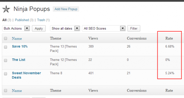
The “Save 10%” popup converts 6.68% of visitors, which is way more than I would get if I relied only on the opt-in form in my site’s footer or sidebar. Why do they perform so well? It’s easy really – they force visitors to make a choice. If you craft a relevant and sincere message to go with it, your visitors won’t mind. Most of these tools offer plenty of settings to adjust when and how often the popup displays. For example, you can set a cookie interval that will restrict the popup from appearing for repeat visitors. That helps cut down the annoyance factor big time.
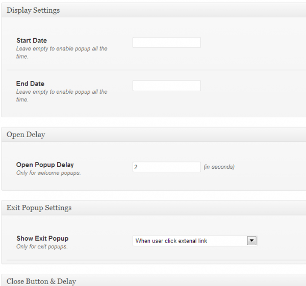
Ninja Forms allows you to adjust all sorts of settings, from the display delay time before a popup displays, to the colors, messages, and much more.
Most of these optin popups include clean, professional-looking designs with a lot of customization features. In the above example, I use Ninja Forms for WordPress. It’s cheap, at only $18 from Code Canyon’s website. However, one downside is that it doesn’t allow for A/B testing. Other WordPress options like Optinskin and Ad Plus List Building popup do include split-testing as a feature, and are worth exploring as well.
Non-WordPress popup tools
If you need something that works on a regular non-WordPress site, check out these other solutions:
- Pippity – This is a powerful plugin that you can use on any site to build subscribers using custom-made popups. It is one of the best out there, and comes with a lot of features to customize the display and behavior of the popup.
- All-in-one Subscription Pop – This fairly basic popup script integrates with MailChimp, Vertical Response, and other major email marketing solutions. It has useful features to display the popup at different times, with delays
- AWeber – One of the most successful email marketing solutions provides an easy way to design your own subscriber popup. Of course you must be a subscriber to use it. I recommend reading their blog post (linked below) for a great summary of how effective it can be.
AWeber published a great post about how plainly simple and effective it was for one regular ol’ blogger to increase her subscription rate 1,375% over her regular sign in form just by adding a popup call to action. I like how AWeber has this feature built into their email marketing platform, which makes it easy to add to any website. In their example, the darkened background helps concentrate attention on the form, and no doubt adds to its effectiveness. I use a “scroll-triggered box” plugin on this site, where a sliding opt-in box appears as you scroll to the bottom of a post, which is a subtle yet effective alternative to popups.
#2. Offer extra downloadable content and resources
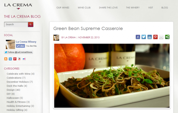
I like to use LaCrema for a lot of examples, because they generate a lot of content and seem to have their act together. Their blog features lots of great recipes, like this green been casserole, which get tons of shares across social media networks.
Here’s a thought – What if they bundled 20 of these recipes together, and offer it at the end of each recipe article as a downloadable item? In return you offer up your email and they get the automated response welcome email with download link.
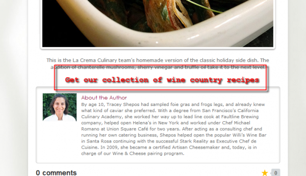
Even if you don’t have any idea how to create something extra, you can always include a prominent signup call-to-action just above the comments. This is what a typical OptinSkin prompt looks like:
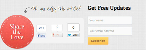
Even a basic prompt like this one can be very effective, simply because it’s clean, highly visible, and appears at the end of a blog post. You can assume that if someone read that far, they’re interested enough to consider signing up.
#3. Allow subscriptions via blog comments
If someone takes the time to leave a comment on your blog, they’re probably engaged enough to consider subscribing to future updates. By offering a small prompt near the bottom of your blog posts, you can easily snag a few more subscribers. I use a plugin called Mailchimp Comment Opt-in on this site, and there are others like it, such as the AWeber comment optin, and WP-Leads.
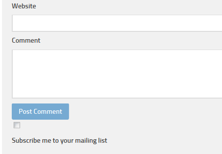
Provide a simple checkbox to offer visitors who leave a comment the opportunity to signup for your mailing list.
There’s also this nifty “Comment Redirect” plugin, which sends users to a nice “thank you” page after they leave their first comment.
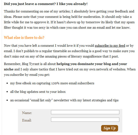
Give first timers who comment on your site a welcoming message that encourages them to subscribe to your blog.
#4. Sold out of a product? Sign up to be notified when it’s back.
If you have a limited supply of a product with high demand, like a wine for example, you’ll eventually sell out completely. If a customer looks at that page, a wonders when it might be available next, why not prompt them to signup to be notified?
I see this all the time on winery websites, and I’m sure it happens on many other sites that have limited inventory. If a visitor is already on a product page, you can bet they’re in a buying mode, and it only makes sense to capture their information so you can inform them when it’s back in stock.
#5. Use Hellobar to display a call-to-action

If you’re not a fan of the popup, but want something that can be almost as effective, consider the Hellobar tool. Developed by online marketing superstar Neil Patel, it offers an unobtrusive way to capture your reader’s attention and direct them to a landing page. You can put whatever you want inside the bar, even a slim signup form if you want. There are several alternatives to Hellobar, and I use one called “Foobar” on another site that I manage. I’m sure there are several other copycats out there, but I find these two work very well.
With a little creativity, you can come up with plenty of ways to grow your subscriber list. Hopefully these examples help prime your thinking about different strategies you can try out on your own site.





Great work, you certainly deserved it. Hope for more better results from your end.
rypacimarketingsolution.coma