A great signup form can perform 500x better than a bad one. That means you stand to gain a huge number of subscribers with the right approach. Unfortunately, most small businesses and blogs pay little attention to this vital piece of their marketing approach. I wrote in the past how a popup style signup form can yield dramatically more signups, and in this post I’ll explore some of the most effective forms I’ve come across and the psychology behind them.
In his excellent book, “Contagious: Why things catch on” Jonah Berger writes:
“After analyzing hundreds of contagious messages, products, and ideas, we noticed that the same six “ingredients,” or principles, were often at work. Six key STEPPS, as I call them, that cause things to be talked about, shared, and imitated.”
I think these same steps form a relevant framework for thinking about how to create signup forms that convert. Those six steps include:
Social currency
How does it make people look to talk about a product or idea? If they feel smart, or feel like an insider because of your content, chances are they will leverage that knowledge with others.
Triggers
We need to design products and ideas that are frequently triggered by the environment and create new triggers by linking our products.
Emotion
When we care, we share. Whether it’s a surprising twist like the “Will it blend” series, or news about a new tax hike in your district, appealing to positive or negative emotions is hugely important.
Public
Can others see what you are using or how the product is practically benefiting others?
Practical value
The internet offers people the chance to learn new things and gain exposure to new ideas. Given how much information is out there however, we need to consider the heart of whatever makes something a good deal. It could be monetary, or otherwise. The point is to highlight the value and allow the person to pass it on to others.
Stories
Consider the broader narrative you can pair with your message. For example, many online marketing gurus spread their message in the context of leaving your day job and having the freedom to work from home. Their message of success and guidance toward this goal is embedded with their own Trojan Horse – affiliate links to products and services they use, or a promotion for a guide they’ve written for example.
With any signup form you create, try to think of the messaging and purpose in the context of one or more of those six STEPPS. Now let’s look at some great examples of how others are using them.
10 examples of great signup forms
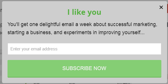
1. OKdork – This site by Noah Kagen features business hacks and tips you can use to build traffic and market to customers. His popup is simple, but effective. The message “I like you” is direct and friendly, and the single sentence below offers practical value and triggers readers desire to improve themselves and their business.
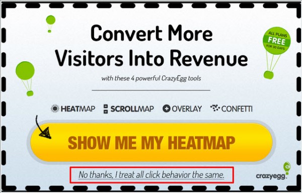
2. Crazyegg – This popular heatmap tool shows you where people click on your website, and provides great insight into their behavior. The message on their signup form carries a good deal of practical value and emotion with it. Who doesn’t want more revenue, simply by understanding where users click and scroll? Consider the “no thanks, I treat all click behavior the same” message as well. By tapping into the visitor’s fear of not doing enough, and their curiosity of learning more about their website users, I’m sure they make a lot of people second guess the decision to close the popup.
3. GrooveHQ – Their blog focuses on business lessons in growth and management, usually in the context of emails and messaging. Their popup has since changed a bit, but the overall messaging and effect remains the same. Like Crazyegg, they make an offer that’s filled with practical knowledge, triggers, and emotion. Who doesn’t want to earn more revenue? They leverage knowledge from their own lessons on business growth, and offer to share with anyone who wants it. Or, you can click the “No thanks, I don’t want to grow my business” link to close it. These types of negative emotion triggers can work very well, as they force the user to acknowledge limitations. 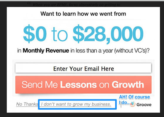
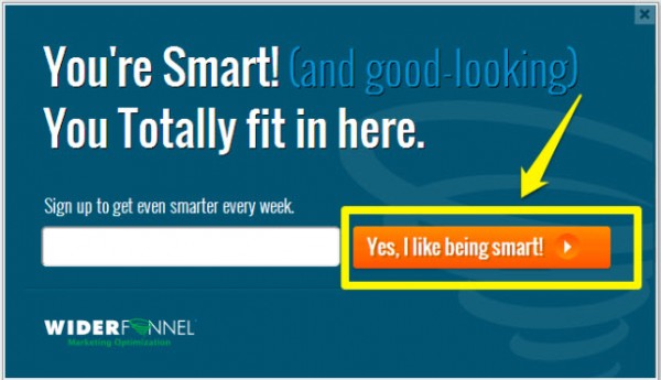
4. Widerfunnel – The marketing optimization experts at Wider Funnel know how to appeal to their readers with this message, which is brimming with positive emotion. It immediately captures their attention with its “You’re smart” hook, and continues to reel them in with the “You totally fit in here” and “Yes I like being smart” call to action.
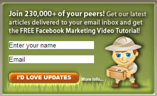
5. Social media examiner – The popular and very useful blog features extensive articles on social media trends and tips. They’ve amassed a huge audience, and display that fact front and center with their signup form. The message to “Join 230,000 of your peers” is laden with social currency and practical value. Anyone who reads that is going to think “If there are that many others signed up, I better jump on board.”
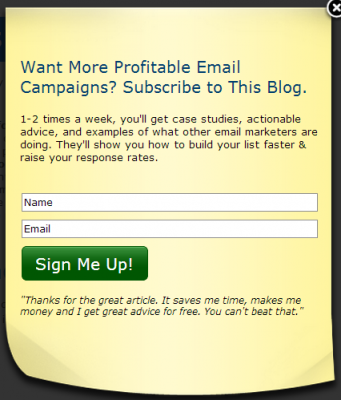
6. Aweber – The popular email marketing service knows a thing or two about popups, and designing signup forms that convert. While not as visually appealing as the others, the messaging is on point. They trigger a desire to improve your email marketing ability, which is highly relevant to readers of their blog. They leverage social currency and public response with the quote beneath the signup button, and the description of what readers will get is loaded with practical value.
7. North Social Media – This website focuses on social media strategies and features very basic but effective signup form. Their call to action highlights a few things. First, it’s free. People like free, and getting insight into actionable tips surrounding their topic resonates with readers. Instead of the ubiquitous “signup now” button, they use a simple graphical arrow that reduces the anxiety you might feel about signing up for another list.

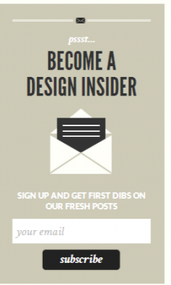
8. Betterment – This blog focuses on graphic design, and presents a simple yet effective signup form in the sidebar. They appeal to the reader’s sense of inclusion and exclusivity by encouraging them to “become better” and get the latest posts before anyone else. In a way, this approach is the opposite of social currency; it instead focuses on social exclusivity and the desire to be part of an inner circle that knows what others don’t.
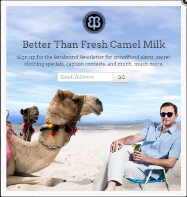
9. Betabrand – This clothing brand takes a creative approach with the types of clothing they offer – from disco pants to soft terry sweatpants that look like dress chinos. The offbeat approach to marketing clothing continues with their popup form. It blends humor and practicality with public inclusion. Those who signup have the chance to get crowdfunded alerts, special offers, and the chance to participate in caption contests (presumably to create captions like the one that appears with their signup form).
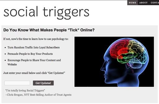
10. Social Triggers – Derek Halpern operates a very popular blog that dives deep into the psychology behind social behavior online. He covers a range of topics, and has gained a lot of popularity for good reason. His signup form is big, bold, and effective. It piques curiosity by asking a question to start. This sort of priming works great because even if you do think you know what makes people tick, you can always learn more. And those additional tips are what he outlines in his bullet points. He also uses a quote from a New York Times bestseller to boost credibility and promote the social currency found within his work.
